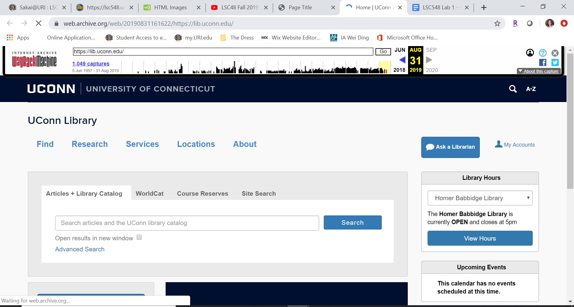
Today’s version of the UConn library website appears very straightforward and user friendly. The school’s name is in a colored banner at the top, “UConn Library” is prominent right at the top of the page, and the search bar is the first thing you see. This version of the site also provides users easy access to the navigation. Navigation tab are right right below the title of the page and in a different color. Without even scrolling down, there is also easy navigation to access to help from a librarian and the library hours. The content of this page is geared toward academic searches given that it is a university library. The search bar has four areas of content to search under, as well as easy access to the advanced search option. If you scroll down on the site, there are all buttons that lead to other search and library aids; such as: “Research Databases” and “Research Guides”. While this site gives the user what they need, it does not have the aesthetic appeal I thought it would. I do not get the sense of school pride in their library’s site. They are known for their mascot, the UConn husky, but it is nowhere to be seen here. With link here.
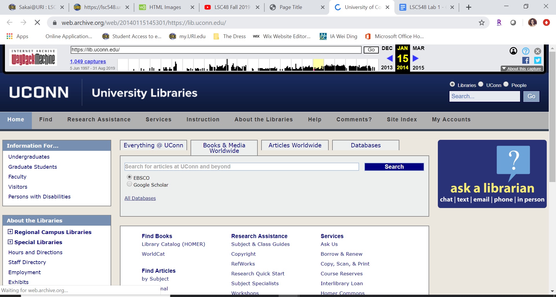
In this 2014 version of the UConn library website, the site appears to have a very “old fashioned” look to it. The background color for the site is that beige color I would have expected to see on a much earlier version of the site, accompanied by the very blocked out sections of the website. Again, like today’s version, there is not much school spirit in the site beyond the name and the use of the color blue. I also find the site to be a lot to look at all at once. My eye does not know where to focus immediately. As far as navigation goes, it does have the tabs right at the top of the page to help users easily navigate to one of those areas. The search bar also has navigation option, but the search bar itself is very small. There are a lot of things students can do from this one page or links they can follow; it seems overwhelming. With link here.
In this 2009 version of the UConn Library website, the site name the university, the library, and provides a general search bar for the library site all on the top bar. This version of the site has the school logo next to its name in the top left corner. The aesthetics of this website are very simple and just display the necessary information, but still include hues of the school colors: blue and white. The navigation options on this version of the site are also absorbent and feel overwhelming. The search bar does have options, but does not include an advanced search. With link here.
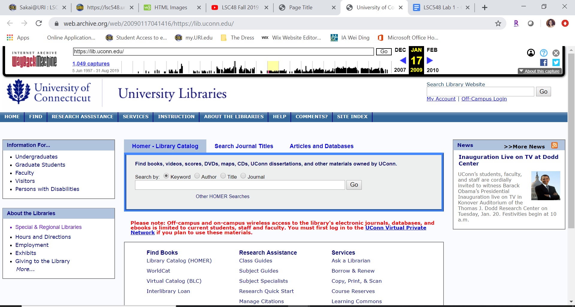
When comparing all three of these versions of the UConn library website, I notice that the 2009 and 2014 version are very similar while the 2019 version is very different. In the 2009 and 2014 edits, there is a lot of content for the user to look at and the information is displayed in segmented boxed. The information within these boxes are just lists of text that all navigate to other areas on the library or school websites. However, in the 2019 version there are still navigation links, but the main focus is on the library search engine. The aesthetic of the 2019 version is also nicer because the information in does display was created in an eye catching way. The important things are in a larger font and in different colors. I also noticed that in the 2009 and 2014 versions the site is titled “UConn Libraries” and in 2019 it is now just “UConn Library”. From what I can see, the website has adapted over time to be more simplistic and more user friendly. However, I thought all three versions could use more school identifiers. It is the university’s library after all.
| Year | Aesthetic Feel | Navigation Options | Content |
|---|---|---|---|
| 2009 | Crowded | Overloaded | Goes unnecessarily beyond library information |
| 2014 | Color blocked and boxy | Overloaded | Every library service is displayed |
| 2019 | Modern and simplistic | Clearly definded | Streamlines most used content |
Through the first task of this lab I learned what a big impact a small change can have on a website. My fiance is in graphic design so he is constantly analysing websites, menus, and more. I also thought he was just being picky (and he still very well could be), but I understand more now how tiny changes have an impact. For example, In the 2019 version of the UConn library website there are still quite a few navigation links, but the important ones were made big buttons in a different color and font size. By doing this I was more alert to these options rather than just seeing lists of links like in the 2014 and 2009 version of the UConn Library website. I also gained more confidence in HTML through this lab. I have worked with coding before, but I was still nervous when I found out I would be building a website. I know that this is just the first go at it and it was pretty simple, but it gives me hope that I can master HTML.
While I did find this lab to be complicated and time consumming, it eased my stress on working with HTML. It really is just a matter of taking your time and tripple checking your work as you go. Though this lab I learned that I can do this and I will figure it out using the tools given, like the video demo and W3Schools tutorials. In this lab I really enjoyed playing around with style aspects of HTML. I tested out a few different fonts and dimentions for my images. What I found difficult in this lab was getting my images to show up and the borded around the table. It was not until I went through all of the "Try it Yourself" tabs under "HTML Images" that I figured out I needed to tell Atom where the file was coming from. It was very much an "ah-ha" moment for me when I did, though. As far as the table, I figured out pretty quickly how to put a border around the entire thing, but I could not for the life of me get the collapsed borders to format correctly. I soon realized I was placing the code in the wrong location and was able to get the complete table. Overall, I feel really good about this lab and what I learned from it.
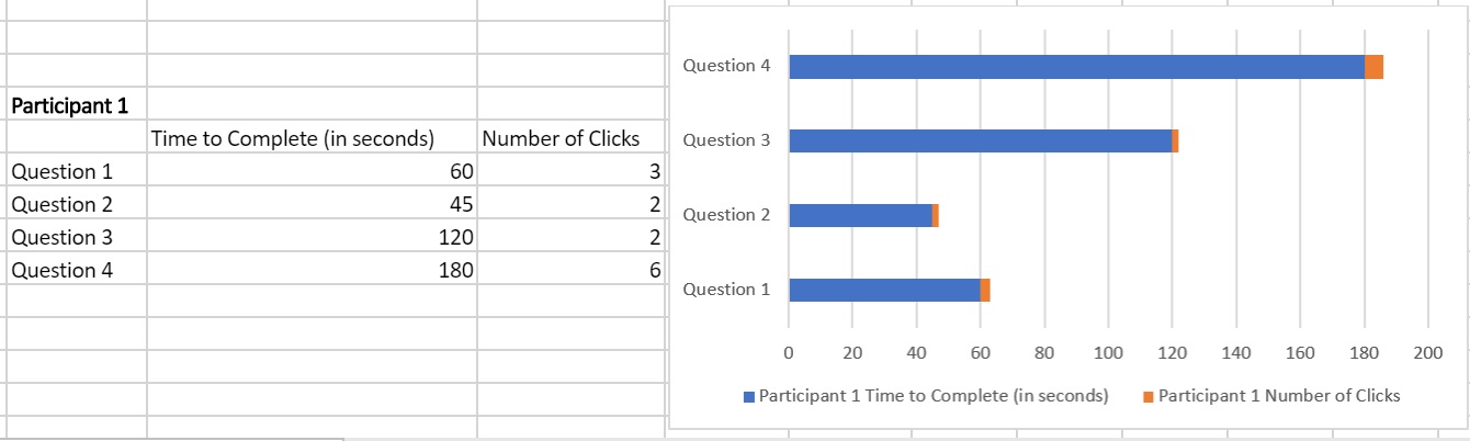
For this usability test, I pulled five participants from various demographic pools. Participants 1 and 2 are of a mature age with moderate technological skills. Participants 3, 4, and 5 are adults with recent college experience and familiarity with university search engines. In brainstorming for this test, I read through a usability test that had already been conducted and analyzed to get a better idea of how to model my test. The one I read was “Primo New User Interface: Usability testing and local customizations implemented in response”, from the book Information Technology and Libraries (Galbreath, 2018, pages 10-35). From this, I learned that I want to ask directory questions, not locating specific book titles. From there, I brainstormed and wrote down eight questions I might want to ask participants. Then, I navigated through the UConn Library web page and narrowed my list down to the four that I felt used the most variety on the site. When asking my participants, I will be looking to evaluate the time it takes them to get through a question and the number of clicks they take to get there. To ensure all participants have the experience, I will follow the scrip: "Right now you are looking at the homepage of the UConn Library website. I will be asking you four navigation questions and observing you as you work through finding the answers. Between each question, I will reset you back to the homepage. It would be helpful if you narrate you actions as you work through each question. Are you ready?"
My questions were:
| Participant | Total Number of Clicks | Total Times (in seconds) |
|---|---|---|
| Participant 1 | 13 | 405 |
| Participant 2 | 20 | 285 |
| Participant 3 | 11 | 135 |
| Participant 4 | 12 | 110 |
| Participant 5 | 13 | 195 |
After conducting this usability test, I noticed that everyone has a different navigation process that they use on any given website. Each participant I observed doing this test used a search method that they are accustom to and would use the same search strategies on any website. Participants 1 and 2 are more mature and both took their time to look through option before committing to clicking on a navigation link. Participants 3, 4 and 5 have all been in some type of schooling in the past five years. These participants all did a quick scan of the site and clicked on a navigation link very quickly. Both participants 1 and 2 surpassed 60 seconds on at least one question; whereas, participants 3, 4 and 5 never took more than 60 seconds on a given questions. No two participants followed the same path to get to the answers. Most notable, none of the participants scrolled down on the homepage of the UConn Library Website. If the navigation link they needed was not visible in the options that they could see, they would not scroll down for it.
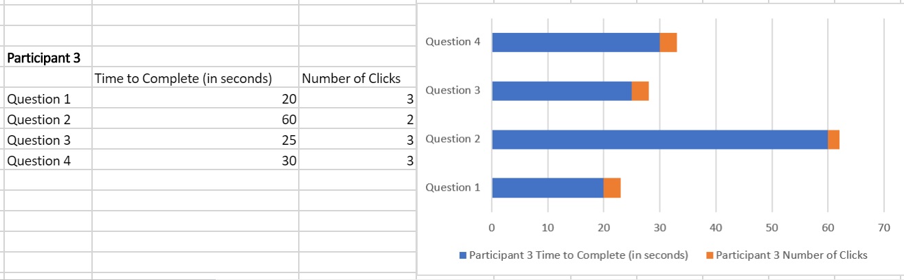
To compare, here is a comparison of participant 1 and participant 3:
For the most part, participants were able to navigate the UConn Library Website with moderate ease. All participants in this usability test used the five tabs at the top of the page to search for specific questions with easy. When participants hovered over one of the tabs, it displays a dropdown menu with multiple options for navigation with a small list of what this link will give you. All the participants used this feature and read aloud the small descriptor. This is a good navigation tool for the UConn Library Website to have. One change I would suggest making to this website, is to move anything they deem “important” or of high volume to the top of the page. I found that participants would not scroll down on the homepage. If the navigation option they were looking for was not found within the top portion of the homepage, they would not scroll down to see they could find it below where the screen cut off. Instead, they would search through the tabs and click the closest thing they could find.
During this lab I learned the true benefits of doing a usability test for a website. In lab 1 I compared the current site (2019) to the site in 2014 and 2009. I thought that the 2019 site was the best bar far and that it was very user friendly. While I still think this is true, I now see some changes that could still be made to make the 2019 site even more user friendly. In the HTML work, we changed our inline elements to be internal CSS. I found this switch to be pretty easy. It also makes adding to the website a lot easier. Now I can just add element without having to explain the style, font color, etc.
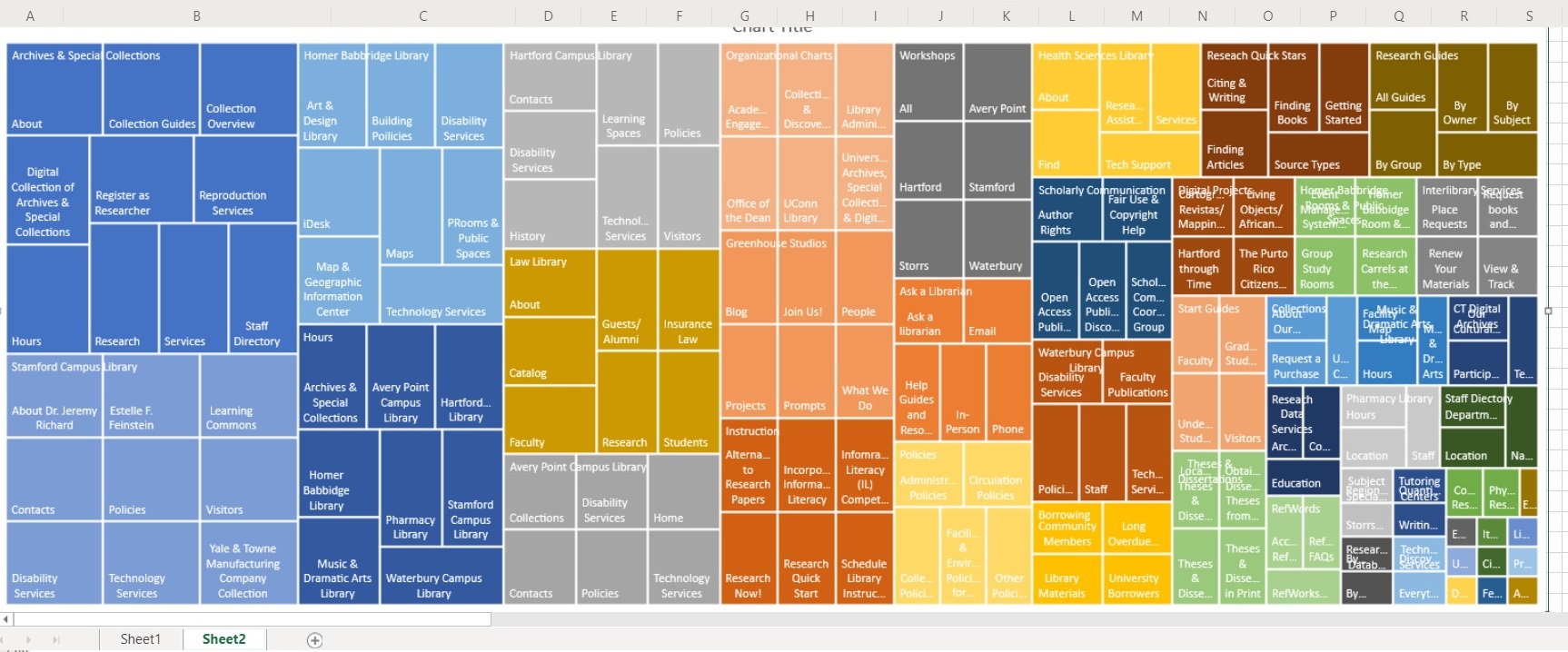
For this lab I created my treemap from the UConn Library Website how it is today. The first level was easy because like many others, their library website has a navigation bar at the top of the page. The level twos for my treemap were also easy to find as the navigation bar terms had dropdown menus. It was time consuming as the instructions stated, but I did not find it difficult. However, when it came to the level three terms, I questioned a lot. I mostly questioned myself; if I was pulling out the right navigation terms. Some were more laid out than others, but overall, I think I made informed choices.
In looking at the treemap that I created from my date, I was a little surprised by what it showed. I did not expect “Archives & Special Collections” to have one of the biggest components. I also did not expect the Stamford Campus to have the largest component of the locations. I thought for sure it would have been the Storrs Campus since that is the most known and populated campus.
This was an interesting lab. I did not expect the results I got, and I also did not expect to get through it as quickly as I did. From the video and written instructions, I thought this lab was going to be very tedious and take several sittings to complete. It definitely required patients and focus, but I was able to collect all of the data in just two sittings. Then, playing with the order of the table to change the treemap was enjoyable. I found it really interesting to see how one small change could impact the treemap. A treemap really provides that visual for the data distribution on a website.